
When viewed on a linear scale over a long enough time period, large American Stock Index graphs look almost vertical.
Drops look crazy steep.
The 1987 crash is nearly a blip on the map while the 2008 crash appears (correctly) to be the largest, quickest downfall in the past 40 years.
- What incorrect decisions do investors make because of their choice of scale?
- What downside is there to picking a linear scale instead of an logarithmic scale?
- Why is a linear scale so deceiving in investing?
Stock Market Returns are Exponential
When looking at stock market returns, it's important you consider returns as multiplicative or exponential.
For example, if the stock market rises 10% then decreases 10% it is not back to where it started! It will be 1% below where it started.
In DQYDJ's own S&P 500 calculator, for example, we report returns as are compounded annual growth rates (CAGR). We multiply numbers together to derive the long term returns we're reporting in the tool.
What's the natural consequence of this math?
Pretty simple, really – the largest increases come on the largest base. Therefore, gains look largest when prices are high – and so do losses.
Percentage Increase is the Best Metric for Investment Returns
To properly gauge returns you need to track percentage increases or decreases.
Percentages measure the actual impact gains or losses have on your contributions. This is especially true if you periodically invest, perhaps through something like a 401(k) (see historical 401(k) contributions).
Each deposit you make to your investment accounts is a new base for percentage gains and losses. Let's take a look at an extreme example: General Electric and Amazon between 2007 and early 2018.
General Electric and Amazon between 2007 and 2018 on a Linear Scale
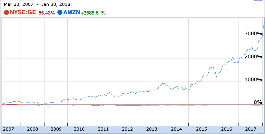
Comparing GE and AMZN's returns since Mar 2007 reveals one major problem with linear scales: they fail to show the significance of stock impact!
In this example, you literally cannot even see GE's fluctuations register. The scale is wildly almost off the charts due to AMZN's growth.
Ignore GE for a second. Eyeballing the chart, you'd think a third of all Amazon gains occurred in the previous three months.
That's not the right way to evaluate an investment. Consider that going from a 1500% to a 3100% increase is really just doubling (just like a 100% gain).
General Electric and Amazon between 2007 and 2018 on a Log Scale
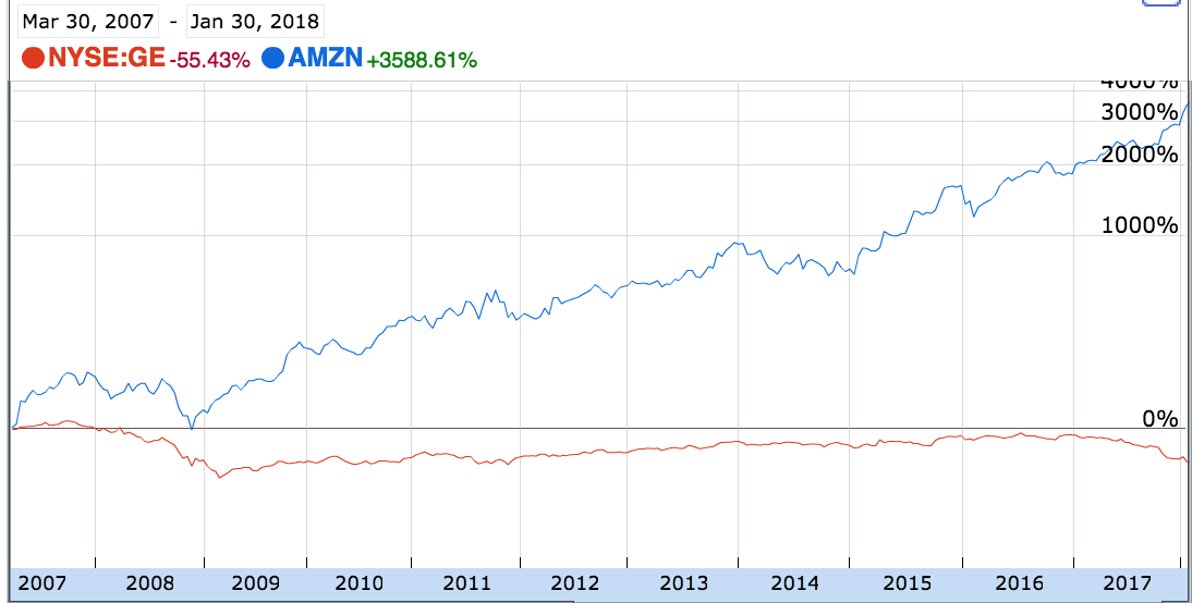
Now, let's compare the same chart on a logarithmic scale.
Above you see the massive decrease in Amazon's value in late 2008 and the massive run-up they experienced from 2009-2011. Both periods are completely obscured on the linear scale.
Amazon's 2015 returns look a bit more fantastic than their 2016 and 2017 returns when moved onto this logarithmic scale.That holds true in performance:
- Amazon returned ~110% in 2015
- Amazon returned ~15% in 2016
- And in 2017, Amazon returned ~55%
Linear Scales Make Every Recent Month Seem Significant
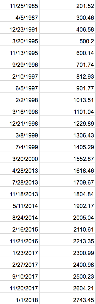
I went back and grabbed the first time the S&P hit 100 point intervals over time through early 2018.
Many benchmarks fell running up to the dot-com bubble (1995-1998 was especially prolific). Technology boom times were followed by a 13 year gap between S&P 1500 and 1600.
Even with a consistent CAGR, you'll see round number benchmarks fall quickly and distorted linear scales.
Take a look at how frequently new 100-point benchmarks fell through 2018 due to the S&P 500's fantastic returns. Another few years of even modest returns will yield a significant number of new highs.
This isn't to say that this guarantees the rate of new records will only speed up. For example, reference the 13 year gap mentioned earlier!
The stock market can wax and wane over long periods, but will quickly break round number price benchmarks when near a peak. (Let's just hope that happens faster than every 13 years.)
Stop Quoting Round Numbers and Showing Linear Scales in Investing
Every time you hear the financial news quote a round number, think back to this article. Humans have a round number bias and it's interesting to see benchmarks fall, it's true. But those round numbers are deceiving if you're used to smaller numbers from earlier times.
The proper – albeit, more boring – way to quote returns is using percentage increases and compound annual growth rates. So, try to stick to percentage math and logarithmic charts and you'll do great.
Happy investing!
