
It's very interesting to view how income shapes up over a career. Add different years of the recent past inflation adjusted to 2013 dollars all to the shape of a career income curve? It's gold Jerry!
In our last article, we explored how career income played out by following a single income bracket over time, starting in various years (with a 25 year old). In these next two articles, we're going to look at it from the perspective of a single year, first for female incomes, then switching our attention to the males. In essence, we will graph how the income curve shook out in each year.
As in our last article, in this article we're interested in the total resources or spending power of each participant, more than their raw income number. That means we attempt to calculate what's left over after taxes, and add in any medical benefits, food benefits, entitlements, transfers, and tax credits received by a person. And, yes, this is United States data - specifically, non-institutional and residing in the United States.
Why a Single Year?
In our last piece, we attempted to turn a relatively static view into a longitudinal study by following centiles of incomes (well, again, resources) over time, as if there was a perfect median or 90th percentile worker. That sort of analysis shows how an "average career" works out over time, as age is associated with experience and better qualification in some specialization.
These two articles keep the experience factor, but keep the economic conditions constant. By looking at age versus individual years, you can roughly guess how experience was affected by economic conditions in each year - if younger folks are hurt it might mean a completely different thing than middle aged folks or older folks.
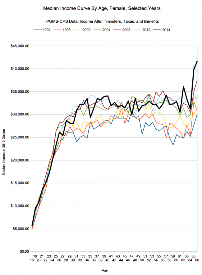
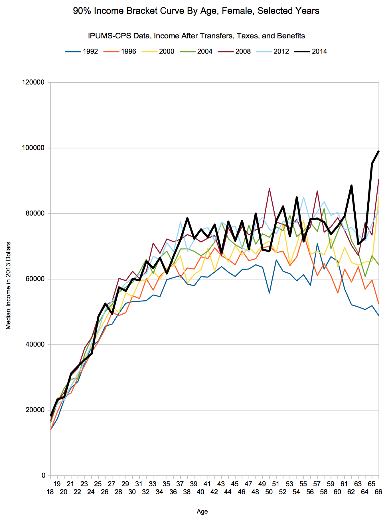
Female Total Incomes By Age, For Selected Years - How Has Female Income Changed Since the Great Recession?
First up, we'll take the median female worker (as we define it, worked at least 1 week and one hour per week in the year asked about in the survey.) Remember, as from the last post, the year listed is the survey year, so the observation year would be one earlier than that (i.e. March 2014 survey would be 2013 annual data).
Anyway, this is a chart of various income curves culminating with the 2014 ASEC survey (2013 annual data):
And next is the 90th percentile female earner:
Sources
Miriam King, Steven Ruggles, J. Trent Alexander, Sarah Flood, Katie Genadek, Matthew B. Schroeder, Brandon Trampe, and Rebecca Vick. Integrated Public Use Microdata Series, Current Population Survey: Version 3.0. [Machine-readable database]. Minneapolis: University of Minnesota, 2010.
Larrimore, Jeff, Richard V. Burkhauser, Shuaizhang Feng, and Laura Zayatz. “Consistent Cell Means for Topcoded Incomes in the Public Use March CPS (1976-2007)”. Journal of Economic and Social Measurement 33(2/3): 89-128
Census Bureau revised income topcode files, accessed 5/13/2015.
Methodology
Same as in our article about the career income curve for 25 year olds starting in different years.
Conclusion
Pretty fascinating drilldown - post transfers, credits, entitlements, benefits, and taxes, female incomes in 2013 were very strong compared to other years. For our 90th percentile worker, most ages were at or near their all time inflation adjusted maximum. For our median female worker, she seems to have lost some ground since the Great Recession - but, to foreshadow what's coming in the next article in the series - she seems to have recovered a lot of her income (ahem, or total resources) across the experience range.
In a metric we just made up which couldn't be emulated in the real world, you can visually see that recent years haven't punished females at the median income too severely. Note that these numbers would represent 'having an entire career as a median earning female in the selected year'. Or, you know, the year minus one, as the survey asks about the previous year:
| Year | Total Career Resources |
| 1992 | $1,217,587.81 |
| 1996 | $1,255,252.14 |
| 2000 | $1,311,108.13 |
| 2004 | $1,411,407.44 |
| 2008 | $1,446,348.22 |
| 2012 | $1,443,157.64 |
| 2014 | $1,431,655.15 |
Late career seems to have given up the most ground, for what it's worth - and it will be interesting to watch this measure shake out over the next few years. All that said, let's hear your thoughts - has the recession punished experienced women more than younger women? Why are the highest earning women performing so much better than even pre-recession? Anything else stick out to you?
