A popular topic in the blogosphere, given new life after comments by Nobel prize winning economist Paul Krugman, is the relative success of the United States vs. the states that make up the European Union. The European Union is a loose confederation of 27 countries in Europe, ranging from Spain to Estonia. Krugman goes so far to suggest that "[y]ou should always bear in mind that when the question is which to believe — official economic statistics or your own lying eyes — the eyes have it."
Not So Fast
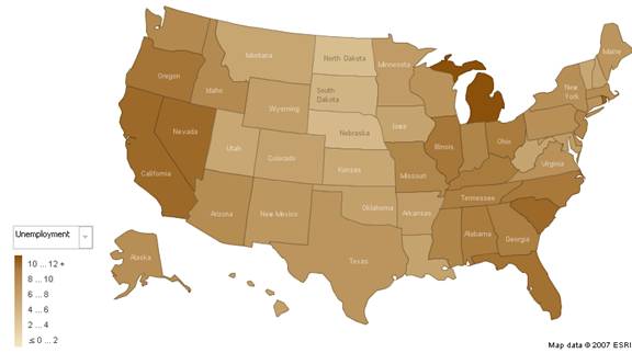
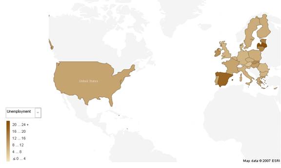
The site Political Calculations inspired me to some data gathering on the issue. An article posted a few days back allows you to take a look at some key economic statistics to compare the European Union (all 27 states, not just the original members) to the United States. The site followed up with a visualization post; the disparity of PPP adjusted income (think adjusted for cost of living), GDP, and Population were available in an interactive map of the 50 states and of Europe. I wanted to take it a slight step further so I added unemployment across the member states of the E.U. and the 50 states of the United States. The raw data is here, feel free to play with it and add more, if you're so inclined (let me know if you do! pkamp3 at dqydj.com). My unemployment numbers come from EuroStat and the BLS.
With a nod to Paul Krugman, this should allow your lying eyes to see the official economic statistics visually. First up, the United States!

- United States Unemployment by State (BLS)

And now, the rest of the E.U. Notice that the scale has changed!
Note that I have included in the links Ironman's data. You can check out the rest of the visualizations through his site or by clicking the links.
Now that you've seen the numbers, what do you think? If you like this sort of stuff, check out my post yesterday on the Massachusetts Senate election. Plenty of fun maps for you to browse!

