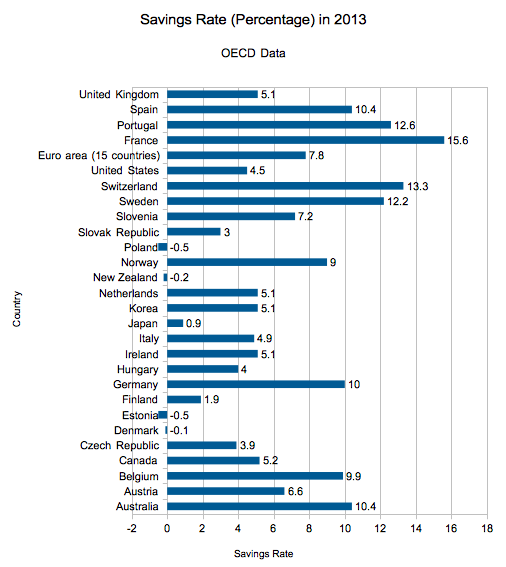
Savings articles tend to be among the most popular articles here on DQYDJ (as in our most popular savings article - our Savings Rate Calculator for determining when you can retire), but we often concentrate on our own savings rate... or at most the savings rate of America. When we saw a link to an OECD tabulation of savings rates across a fine selection of countries, we knew we'd found an interesting data set that you folks would love to see.
So, how about it - if your savings rate was the sole determinant of what country you lived in, where would you be teleported?
The UK, Spain, Portugal and France are gross savings rates, everyone else is net (the type we prefer). I did find it interesting that the EU outsaves the US. Also interesting is the Demographic tales this chart can tell - Japan, for example, has an oft-pointed out aging population... we would expect their lower savings rates as retirees would be expected to withdraw more than deposit.
See anything else interesting in the above chart? How's your savings rate looking this year?
Sources
OECD (2014), "Household saving rates - forecasts", Economics: Key Tables from OECD, No. 7.
doi: 10.1787/hssv-gr-table-2014-1-en

