
I promised in our last post on female income curves over selected years that I would follow up with the male post - and today I deliver the goods. This article gives a visual look at the male income curve over a single year - that is, using age as a proxy for experience and holding economic conditions static (all ages are in the "same" American economy, since it is a one year snapshot); we're showing earnings for males in the median and 90th percentile of incomes.
Well, technically, as I stated in the last couple articles in this series, it's not incomes that's so important - it's total resources. That means all numbers have taxes removed, and benefits, credits, and stimulus programs added back in. See the original article on resource curves over time for the full definition.
Total resources are an estimate of how much a person has left over after taxes, plus any credits, transfers, entitlements, and health benefits besides. This is a truer representation of spending power, since it estimates how much spending power an individual actually yields including non-monetary income, and is closer in line to how the Census Bureau now measures poverty for families.
Without further ado, here is a snapshot of how male incomes shaped up in selected years in the past.
How Have Male Incomes Held Up Over Time? Since the Great Recession?
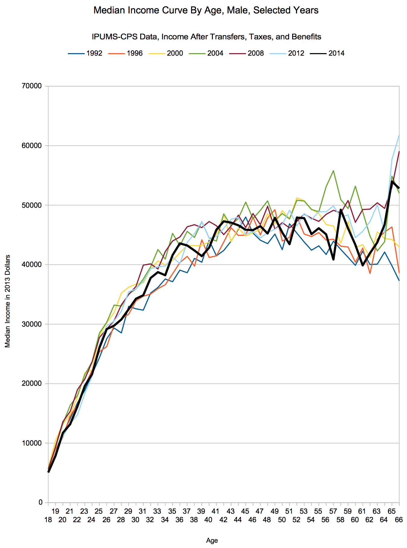
Remember, these dates are 'survey dates' - from the ASEC in March of the listed year. That means the respondent is listing income from the year before. That means 1992 is actually the March 1992 survey, and we are looking at 1991 annual data.
First up, just like in the female income article, median incomes:
And next for the 90th percentile of male incomes:

Sources
Miriam King, Steven Ruggles, J. Trent Alexander, Sarah Flood, Katie Genadek, Matthew B. Schroeder, Brandon Trampe, and Rebecca Vick. Integrated Public Use Microdata Series, Current Population Survey: Version 3.0. [Machine-readable database]. Minneapolis: University of Minnesota, 2010.
Larrimore, Jeff, Richard V. Burkhauser, Shuaizhang Feng, and Laura Zayatz. “Consistent Cell Means for Topcoded Incomes in the Public Use March CPS (1976-2007)”. Journal of Economic and Social Measurement 33(2/3): 89-128
Census Bureau revised income topcode files, accessed 5/13/2015.
Methodology
Same as in our article about the career income curve for 25 year olds starting in different years.
Conclusion
Go back to the female version of this article and take a look at the two graphs - pretty different, eh?
Male incomes have been decimated since the Great Recession, and this data really drives the point home. In the median income (total resources) graph, the only age which had the most resources of all time (at the median) was 43 year olds - more than balanced out by the poor showing across the 50s age bracket.
Sure, the numbers are synthetic, but if you could spend your entire career as a median earning male in the selected years (for each one, subtract one for the year the income was earned in - these are survey years), here's what you'd show for 2013 dollar normalized resources over a career spanning from age 18 to 67:
| Year | 1992 | 1996 | 2000 | 2004 | 2008 | 2012 | 2014 |
| Total Career Resources | $1,809,489.58 | $1,858,032.37 | $1,962,604.94 | $2,068,996.97 | $2,053,865.30 | $2,011,422.69 | $1,936,943.68 |
By that measure, the Great Recession set men overall back to before the tech bubble, let alone the Great Recession. Sure, a lot of that is shifting industry balance - but even a fair performance from the 90th percentile of earners (by the same measure, with a career curve in 2013 equal to sometime between 2000 and 2003).
So, yes, this is an important metric to watch. Let me know your thoughts in the comments!
