Today we're going to delve into Income Equality, a topic which has been fresh in the American collective consciousness ever since the Great Recession ended.
Gini Index
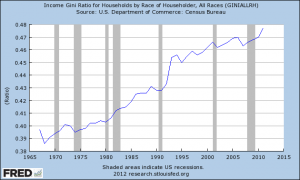
If you click the above image, you'll see a graph from the St. Louis Fed (Census Bureau Data) showing a measure known as the 'Gini Index' headed up and to the right. A Gini Coefficient measures inequality in a distribution, but is most often used in the press as a shortcut to demonstrate rising wage inequality in a country. In America, this tendency has lead to a fair amount of Sturm und Drang amongst the Literati about how {insert policy or political scapegoat here} is destroying the middle class, starving the poor, enriching the wealthy, or something else generic and scary.
You're looking at a graph of the Gini coefficient spanning back to 1967 (.397) and ranging to 2011 (.477). In essence? The graph is showing that income inequality is widening in the population sampled - the population being households of the United States. Here are the numbers on some other countries.
An Important Distinction
Now, nobody is questioning the validity of the data shown in the graph. Undoubtedly, household incomes are diverging and becoming more unequal. Note, however, that I keep mentioning the word 'households'. Are we really measuring what we want to measure? If our concern is with incomes in the United States... shouldn't we actually be looking at individual incomes?
At this point, I should note that this line of questioning isn't home grown. Ironman at Political Calculations has already used published Census tables to calculate individual income Ginis (this led to some nonsensical arguments from people politically opposed to the idea that household inequality is overrated). Mathematician and Physicist Ivan Kitov has done some work with Census data back to 1947. The main arguments against their methods? Garbage in, garbage out.
You see, Census income data is 'topcoded'. That means that incomes are bracketed by the whims of the Census, with ranges arbitrarily picked back in the beginning of census-taking and the 'top income' set at some value like $100,000 or $250,000. The argument is there are uncaptured differences because of the low resolution of the lower brackets and the top coding (since >$250,000 'only' puts you around or at the top 1% of individuals).
Enter IPUMS-CPS
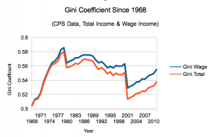
Okay, so the issue here is people opposed to the individual income argument don't like the data being used to create the models. Luckily for us, we can go a step further than the Census data, and pull microdata from the University of Minnesota, who release anonymous Current Population Survey data to anyone who can fog a mirror (well, and sign up for an email address). A great grant supported service if I've ever seen one, IPUMS-CPS was particularly helpful in getting me microdata going all the way back to 1962 - and as an added bonus, since March is the goto heavy interview month of the CPS, we even have 2012 in there. Is the data topcoded? Sure is... but at $999,999, the number of people falling out of that range is so miniscule you'd really be clutching at straws to keep hating the data. Let's see what we found:
Data before 1968 is a bit weird, but contact me and I can provide you with the full set.
Explaining the Graph
Why 2 lines? Well, we wanted to preempt complaints about rich people receiving money from non-wage income so we did it for both wages and all sources. You're welcome.
As you can see, there is an easy way to equalize incomes - just have a recession! The tech bubble was a tremendous income equalizer, as was the end of Jimmy Carter's presidency/the beginning of Ronald Reagan.
Sources
Miriam King, Steven Ruggles, J. Trent Alexander, Sarah Flood, Katie Genadek, Matthew B. Schroeder, Brandon Trampe, and Rebecca Vick. Integrated Public Use Microdata Series, Current Population Survey: Version 3.0. [Machine-readable database]. Minneapolis: University of Minnesota, 2010.
(To reproduce my data, select all March samples from 1962-2012, weight by WTSUPP, and use the weighted Gini calculator in the R package laeken).
Wrap it Up...
So, what exactly is going on here? Individual incomes are less unequal than they were previously, yet household income inequality is reaching new highs. Well, actually, that explains it - something is up with households. That makes logical sense - if incomes are depressed, perhaps some of the following things are happening?
- The lower earners are less likely to marry other lower earners, meaning that poorer households are actually single person households.
- Students earning less money than expected move back home after college, increasing middle class incomes (turning 1 and 2 earner households into 2 or 3)
- Folks of all stripes are holding off on divorce, meaning that already formed households have 2 earners instead of one.
- (I kid, mostly...) The well off are pooling resources in communal living setups.
So perhaps we've been going about this 'issue' all wrong. Instead of trying to dictate economic and tax policy (and protests!) on this flawed number, perhaps we should try to fix it with social policy? Here's one proposal: make the rich marry the poor!
PK for President, 2016!


