In baseball, earned run average is a measure of how many runs a pitcher would give up if normalized over 9 innings (9 innings is the length of a baseball game - 3 outs per inning, 27 outs total). To calculate earned run average, multiply 9 * (runs allowed by a pitched / innings pitched).
The magic comes in the numerator - the number of runs allowed by a pitcher. This doesn't mean that every time a pitcher has a runner cross a plate while he is in the game he 'allowed' that run. If a pitcher relieves another pitcher mid-inning, the previous pitcher is still on the hook for the number of batters he allowed to reach base.
How does this relate to Fed Chairmen? Let's just say that Paul Volcker is a stud reliever and William Miller handed him the ball with a bases-loaded, no out jam (and probably a 3-0 count).
The 3 Month Lookback
Over Paul Volcker's 84 months as chairman (give or take 1), it is true that the annualized inflation under his reign was 5.69%. That's not the whole story, or even the most important story, however.
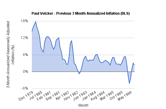
- William Miller's last 3 months registered a 13.521% annualized inflation rate (I call this stat 'inflation velocity').
- Paul Volcker's last 3 months registered a puny 2.220 % rate.
Numbers like these made me want to go Sabermetric (who's seen Moneyball?) and come up with some even better measures of Fed Chairman efficiency! Here is my source data from the BLS, and here's a chart of Paul Volcker's inflationary performance as Fed Chair.
Fed Chair Rankings: Getting a Clean Inning to Pitch!
Volcker and Greenspan both pitched well and handed the ball off with a lead - hoping their relief could keep it.
Let's look at how our recent Fed Chiefs (I could find M2 Money Supply data back to 1959, so we'll go back to the tail end of the reign of William McChesney Martin) have performed. Oh, here's my M2 data (Seasonally Adjusted.)
An explanation of my metrics is in order. Annual inflation and Annual M2 increase are self-explanatory. Lower is mostly better - Ideal inflation is argued to be somewhere under 2.5% (but above 0%). The Federal Reserve under Janet Yellen currently targets 2%.
- "Diff. Inflation & Previous M2 Increase" - The difference of a Fed Chair's annualized inflation and the previous Fed Chair's M2 Increase. Roughly, larger is better/more impressive.
- "Diff. 3 Month Slope and Annualized Inflation" - The difference of a Fed Chair's annualized inflation and the previous Fed Chair's 'inflation velocity', which I defined as implied inflation by their last 3 months in office. Roughly, larger is better/more impressive.
- "Diff. of 3 Month Slope Beginning and End of Term" - The difference of a Fed Chair's 'inflation velocity' and the previous Fed Chair's 'inflation velocity' (see above). Basically, what situation did the Chair hand off to the next Chair? Roughly, larger is better/more impressive.
Fed Chair Rankings: Questions for Me
- Why Did You Pick M2 to Track a Previous Federal Chairman's Performance? M3 wasn't available! Kidding! M2 is the widest measure of monetary supply available, and Milton Friedman's opinion summarized is "inflation is always and everywhere a monetary phenomenon."
- Why Did You Define 'Inflation Velocity' in that Way? It's basically using the 'modified limo' method from Political Calculations, but is traced to Steve Conover's 'climbing limo'. I just did it over 3 months - a single month is too volatile, and 6 or 12 seemed too much. Fair? If you disagree, here's my source data. Feel free to let me know if you rerun the numbers; I'll link back to you if you come up with new metrics! Inflation velocity would be like the slope of inflation - the first derivative if there was a nifty equation to track inflation!
- Can You Guarantee Your Data Is Good? Consider this my peer review. If you find a mistake, I will definitely fix it and give you a hat tip.
Fed Chair Rankings: The Conclusions!
While the absolute numbers represented by the 2 points on the left are great, the 3 numbers on the right of the chart measure how well the Fed Chair performed in the situation they inherited.
In a similar argument, the entire economic situation we currently find ourselves can't be entirely laid at the feet of the current administration - presidents and Federal Chairmen don't live in a vacuum. What I'm measuring is how they played the hand they were dealt, or, if I may (I hope I don't ruin baseball for you!), if they pitched themselves out of the inning.
While Ben Bernanke had decent stats, both he and Alan Greenspan came into a clean inning. Paul Volcker impresses me the most - he took a horrible situation and turned the game around. From the stats I have presented, I would rank Ben Bernanke a solid third out of the last 5 (and 6, if you toss in the tail end of William McChesney Martin's term) Fed Chairs.
While Mr. Gingrich and Mr. Romney were wrong to imply Ben has been the most inflationary Chair ever, he's still pitching.
At some point I'll redo the Fed Chair rankings to work Janet Yellen into the mix, but let me know if you like how I set it up!


