One of the things we like to do here at Don't Quit Your Day Job is to reveal interesting things hiding in plain sight. One of those things: subtracting the Daily Treasury Real Yield rate from the Daily Treasury Yield rate gives you a good idea of the market's expectations of inflation. Even though media prognosticators won't agree on whether we're in for a deflationary era, hyperinflation, or a whole lot of nothing, you can get a reasonable prediction from market data. Our explanation is below, along with the limitations of this method.
Why Does This Method Work?
The daily treasury yield curve, which is a model of the yields of a selection of Treasuries from one month to 30 years, represents the yield that would be paid (annually) on a treasury bond if bought on that day. Its cousin the daily treasury real yield curve is a model of the yields of a selection of TIPS, or "Treasury Inflation-Protected Securities" over periods ranging from 5 years to 30 years. A treasury pays out a fixed rate - it will always (as in, "the US has never defaulted" always) pay exactly the coupon rate on the bond if held to maturity. TIPS are a different beast - they will pay the yield captured at purchase plus will be adjusted for the Consumer Price Index, a measure of inflation. To isolate the expected inflation, we only have to subtract the 'real yield' (meaning "above the CPI" or "yield above inflation") from the guaranteed yield of the treasury of like maturity. Simple enough.
Where Does This Break Down?
Remember that we are using the CPI as a measure of inflation. There are various arguments for the CPI being a weak indicator of inflation (although Cameron might disagree). Another reason is that even if it is perfect it still likely won't reflect the inflation experienced by any one individual (that person may experience less or more inflation than the CPI).
Secondly, there are much better ways of gauging the market's expectation of inflation including using zero coupon inflation swaps. Basically, there is a risk premium built into treasuries that leads to TIPS being undervalued during periods of market uncertainty. Another factor is TIPS will not adjust for deflation if CPI is negative. For more details, please check out the Federal Reserve Bank of Cleveland's working paper on the subject (which has a great primer on estimating inflation). They also have an index based on that methodology - which we will put to good use in future articles.
Onto the Chart!
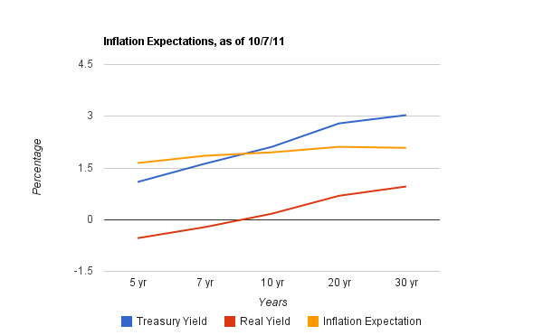
Here's what you're looking at:
- The blue line is the infamous Treasury Yield Curve. A well behaved yield curve goes up and to the right, like any chart you present at work. Curves that don't may signal recession, or may signal market intervention (manipulation?).
- The red line is the real yield. Yes, it is possible for it to be negative. In fact, the real yield was negative for a decent portion of the period from 2002 - 2005, and one theory explored in the working paper linked above is that a negative real yield contributed to the real estate bubble.
- The yellow line is what we were trying to find, the "market inflation expectation". You should read it as "per year", so the market expects 1.63%, 1.84%, 1.94%, 2.1%, and 2.07% inflation annually for the ranges listed in the chart above.
Thoughts? Questions? Complaints? We hope that, at a minimum, this post helps explain why mortgage rates can be so low (and it's not that banks are willing to lose money to inflation).

