
On this page we examine the history of the relationship between long term and short term government debt yields in the United States. We're especially interested in when the yield curve inverts - or short term borrowing costs exceed longer term costs.
In a recent inflation article, we examined the yield curve measured by the 10 year and 2 year US Treasury. This article pulls the series back to January of 1871 by merging data on various short term debt instruments and comparing them to the 10-Year US Treasury Yield.
Long-Term History of the Yield Curve Through April, 2018
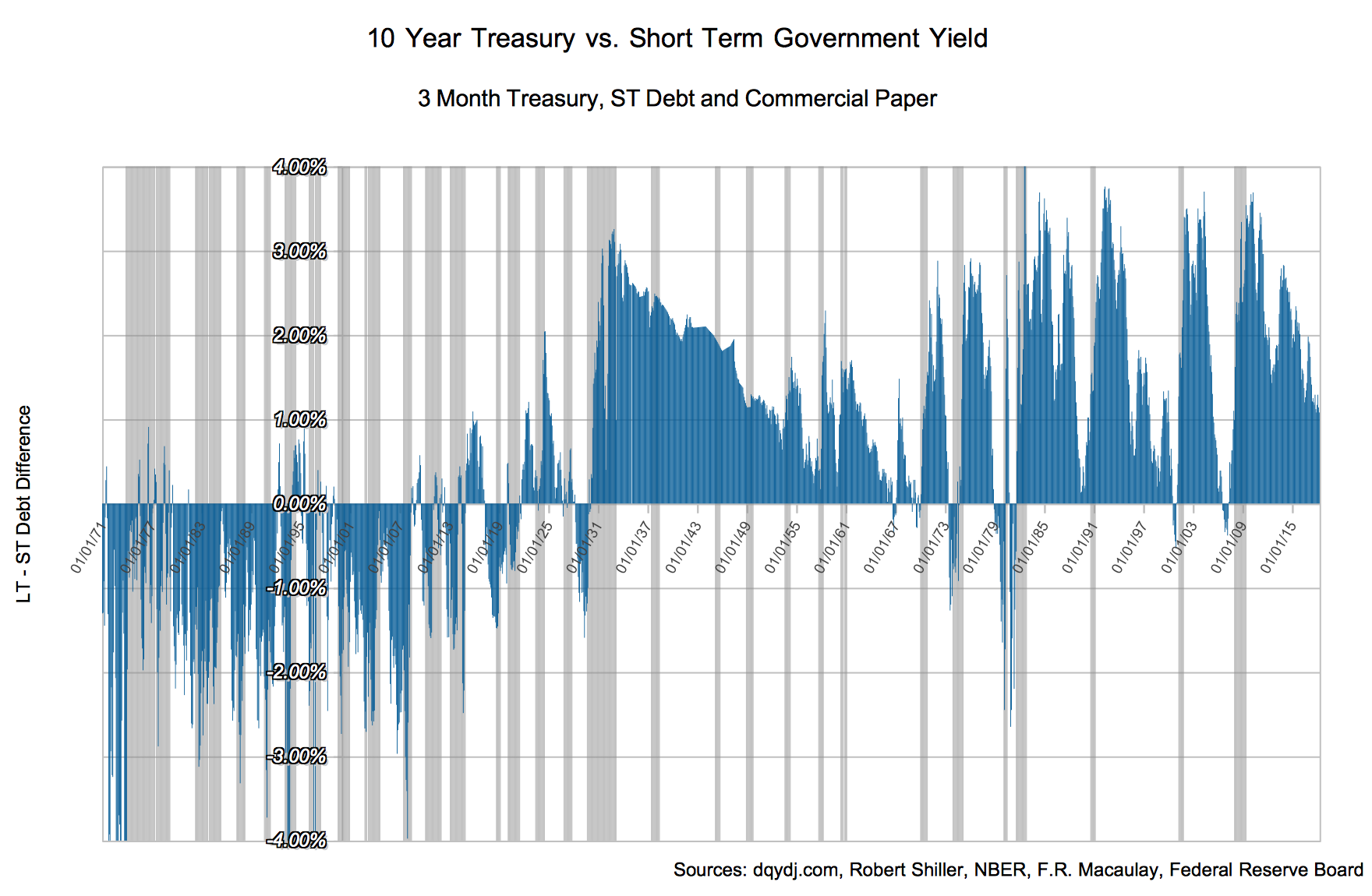
10 Year Treasury Yield v. Short Term Debt, 1871 - Today (Click to enlarge)
Pictured above is the 10Y – 3-6 Mo US yield difference from January 1871 through April 30, 2018. Since the yield curve is a curve (ha) we're showing the difference between just two points: short term and long term debt. Those terms are rather ambiguous, and we are about to make it worse:
- Long-term yield is based on the 10-Year borrowing cost of the US government.
- Short-term yield is a synthetic hybrid of commercial paper and 3-month (91 day) government debt proxies.
Conclusions on the Yield-Curve Inversion Relationship
Any time you toss recessions onto a graph with a decent timeline you recognize the stability after the Federal Reserve came into play (and especially after modern government debt issuance practices). While we speak of 7-10 year business cycles nowadays, recessions used to be quite common in the United States.
Indeed, the whole yield curve inversion omen is a modern-ish invention. The first time it was even usable as a harbinger of recession was when the curve inverted in the midst of World War I in May of 1917 (recession followed ~1.5 years later). Before that it wasn't obvious that long term US government Debt had supremacy over short term debt - or even commercial paper!
Since then it's been a reliable sign of an impending recession - even using the imperfect blended measure we came up with for this post. (Want to explore interactively? Our 3D Treasury Yield Curve Chart visualizes daily yields from 1990 to today — rotate, zoom, and animate through time to see inversions form and resolve.)
However, it isn't an immediate measure. In the next post we'll look at timing with the inversion and what it all means - and clean up the data to release to you folks to do your own work.
Methodology on the Long-run Yield Curve
Long-term borrowing costs are relatively simple to find. If you read DQYDJ, you know we're big fans of Robert Shiller's work. For the 10 Year Treasury rate, we took his series which extends back to 1871.
On the other hand, unified data on historical short-term US borrowing costs is hard to come by online.
While ideally we would use 2-Year Treasuries as the short-term point, they're a relatively modern invention. In fact, treasury note auctions in general weren't even a thing in the US until 1929. Prior to government bond issuance in the late 1910s, short term commercial paper (!) was the best proxy for short term interest rates (as documented by Lawrence H. Officer of University of Illinois at Chicago in What Was the Interest Rate Then? A Data Study [PDF]).
Long story short, to counter the 10 year on the short-term side we blended four series into one:
- 3 Month Treasury Bill Secondary Market Rates from the Treasury Department
- Short-Term US Security Yields for 1920-1934 and 1931-1969 from the Federal Reserve Board
- Commercial Paper Rates in New York from NBER and F.R. Macaulay
Finally, we used the NBER-determined business cycle and recession periods.
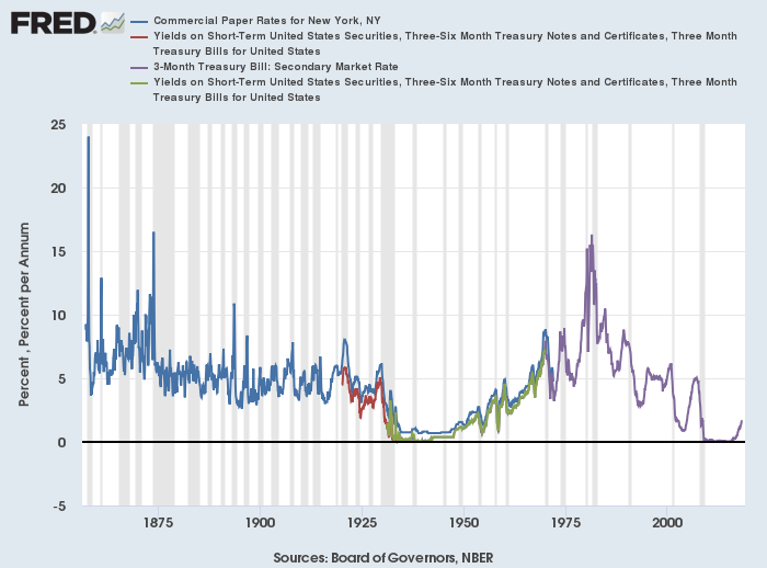
Merged series comprising DQYDJ short term US Debt estimates
Visually, you can see that the sets are well-correlated. It's not perfect though, so we took the average difference between the series to come up with estimated adjustments to blend the rates. Our gold standard for 'short-term' was the 3-month Treasury Bill secondary market rate.
The final adjustments, for your consideration:
- Where we used commercial paper as our proxy: Subtract 62.267 basis points
- Where we used the 1920-1934 short-term series as our proxy: Add 22.046 basis points
To translate: these are quick cuts, not graduate thesis-level adjustments to blend these rates. Consider this a decent jumping off point for your own scholarship.
Putting it to work: this same blended short-term series is the cash (and risk-free) benchmark in our Stocks vs Bonds Historical Returns calculator, where you can run it against the S&P 500, the 10-year Treasury, and a 60/40 portfolio back into the 1800s.
