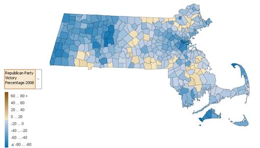
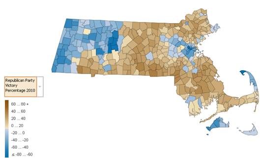
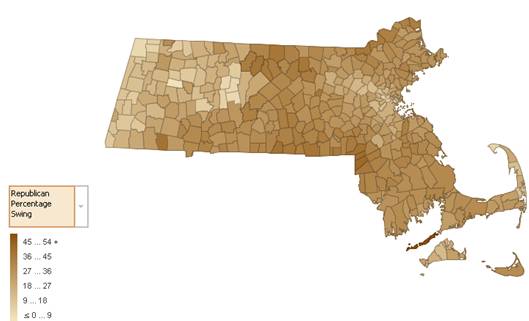
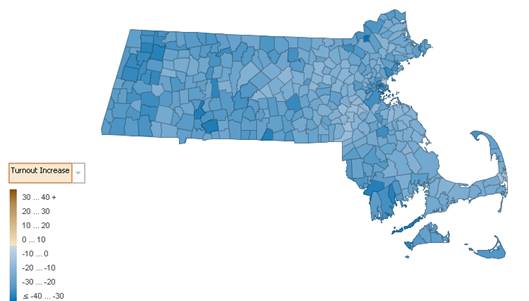
Inspired by Ironman's Political Calculations post on Many Eyes and a visualization on that site, I decided to try to visualize the 2010 Senate election in Massachusetts. Using the tools at the site and data from the Boston Globe, I present four visualizations (by town): the voter turnout decrease in 2010 from the 2008 Presidential elections, the Republican margin of victory by town in 2008 and 2010, and the Republican vote swing from 2008 to 2010.
Visualizations by Town
For all of these visualizations, I received my 2008 data from this site at the Boston Globe, and my 2010 data from this one. You can check my results and edit my data, which I uploaded to Many Eyes. Thanks to the folks at Many Eyes for adding the Massachusetts map to the site!
First up, the results from the 2008 Presidential Election. The degree of blue/brown is the margin of victory for Barack Obama (blue) or John McCain (brown).
Next up, the 2010 Senate Election. Now the darkness of blue/brown represents Martha Coakley (blue) and Scott Brown (brown) victories per town.
At first glance, the change is pretty obvious. However, the next map shows the increase in the Republican voting percentage.
And finally, here's a map showing the decrease in voter turnout from the 2008 Presidential election to the 2010 Senate Election.
There you have it; voters turned to the Republican party in large numbers. Every single town and city in Massachusetts had a higher proportion of Republican voters in the 2010 Senate election than the 2008 Presidential election. Every town and city also saw a decrease in the number of voters. What do you think?


