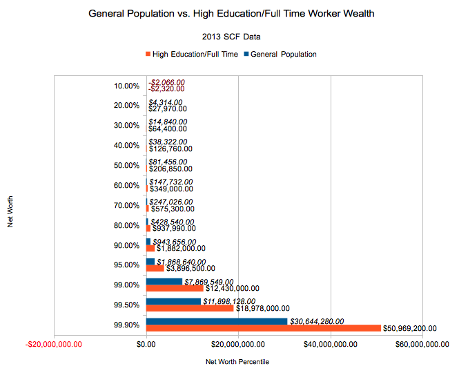
If you recall from our series on the Current Population Survey, we concentrated quite a bit on a peer group that will seem quite familiar to folks who generally read this site - that is, people with full time jobs and a degree in something. As that's the demographic which most frequents this site (and since you're a reader, you probably agree...), let's turn the spotlight on our high achieving peers, full time workers with degrees. How do they stack up in Net Worth?
American Net Worths for the General Population and High Achieving Workers with Degrees
Once again, our source is 2013 Survey of Consumer Finances microdata.
As you'd probably expect, full time workers with degrees 'beat' the general population in terms of higher total wealth - at least once you're in above the 8th percentile or so (student debt at younger ages cancels out the larger net worths at the bottom of the distribution). For most of the middle of the distribution, the high achievers have attained 100% higher net worths, although the range (but not the absolute number!) narrows a bit near the top of the charts.
A technical note: the SCF divides respondents into 'families', which behave sort of like households, if you put more taxpaying restrictions on said households. Data was weighted to 122,530,070 'families' and most questions pertain to the head of household. This left us with 31,608,667 high achieving 'families' in our dataset - 25.8% of all 'families'.
Over 90% is where we saw the narrowing - you can see it a bit above, as the corresponding high achiever doesn't double their general population peer. We didn't dig into the exact reason - perhaps at a higher income, folks are
Methodology/Source on Full Time Workers with Degrees Net Worths
All numbers calculated from 2013 Survey of Consumer Finances microdata. Unlike our last article, we took an even lazier route for this one, using the 5 imputed data sets as one large sample (but maintaining the individual weights), instead of computing each set separately and averaging. Again, we didn't calculate an error range, so it would probably be best to reproduce these calculations for academic or policy work (send us an email, we can help).
For informational purposes, we're happy with the results.
Your Thoughts?
Do you think folks are stopping full time jobs as they hit the top 10%? Would you? Did you expect the narrowing gap near the top? Let us know in the comments!

