While we don't write on it every month, JOLTS, or the Job Openings and Labor Turnover Survey from the BLS, is one of our favorite surveys.
Although it has only existed since 2000, it attempts to characterize how and why (and when!) jobs turnover, and lets us look at how people and firms are behaving at an impressively high resolution.
Quits to Separations in July 2018
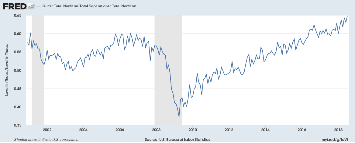
Our favorite indicator of job market strength is the quits to separation ratio. Although JOLTS hasn't been around for an extremely long time, the strength of the QtS ratio is enormous.
Here is a measure that, in one number, breaks down the confidence of job seekers in the market by summarizing the number of quits versus the total number of jobs turned over. In the worst of times – and we've seen 2 recessions while JOLTS has existed – involuntary turnover (layoffs, firings, and the like) starts to increase.
In good times?
Presumably, you see something like the above with most separations coming from quits. In July of 2018 the ratio clocked in at a very strong 64.75%.
That's the largest print we've ever seen from the survey, so we're in uncharted territory here. That said, ~2/3 of all separations being quits feels very strong.
Labor Market Turnover From Quits
Of course, there are limits to ratios.
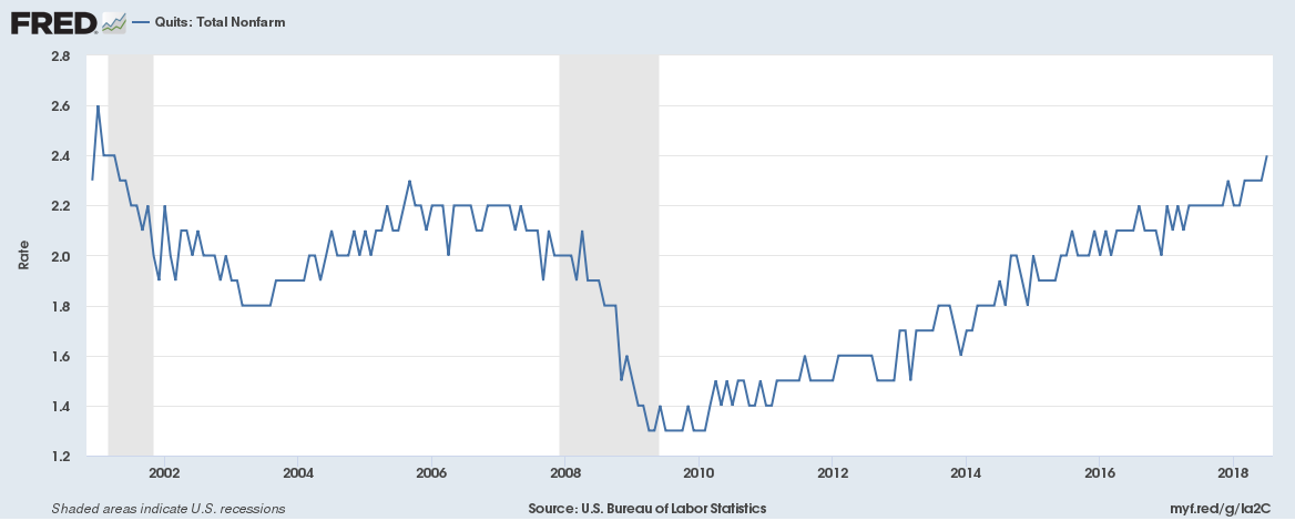
Either input to the ratio can cause the ratio to change. Imagine a scenario where turnover drops off at the same rate as quits and masks a broader issue (think price to earnings when both fall). The proper check then, therefore, is looking at one of the ratios in relation to something else.
Above we've graphed the percentage of positions that turned over from quits (currently 2.4%). Other than a few high prints before the tech bubble burst, you're looking at highs for that ratio as well. Also interesting to note: before the Great Recession, quits had already started to move south.
Reading the JOLTS Tea Leaves
We know many of you readers are very big fans of JOLTS, and we're in the same camp. Breaking down turnover numbers reveals a goldmine of information of the revealed preferences kind.
To us, the current numbers scream strength in the labor market. Hopefully it lasts a while.
See anything interesting in the data? Any indicators you watch that tell a similar - or more importantly, a different - story about the labor market?


