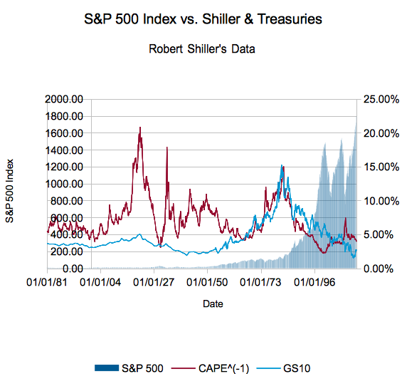
We recently covered (graphically, anyway) the relationship between the Ten Year Treasury Yield, Shiller's CAPE (inverted) and the S&P 500 Index. Although it was sort of possible to estimate the returns that followed, we'd be a bit uneasy if we forced you to do too much squinting - truly, you don't want your eyes to end up like mine. If that was "Risk Free Rate 101" course, consider this the 201 course: let's look at Shiller CAPE versus the risk free rate, represented by 10 Year US Treasuries.
Shiller's CAPE Versus the Risk Free Rate
Let me refresh your memory on the last article by reproducing its key graph, summarizing Robert Shiller's data on the S&P (not just the 500 - he also has the pre-500 and a synthetic measure back to 1871). Shiller's CAPE measures the inflation-adjusted last 10 years of earnings on the market versus the current S&P 500 index price, a very conservative way of looking at earnings that generally includes all stages of the business cycle.
We 'invert' CAPE, turning it into a measure of how much of the price is made up by the average earnings. This allows us to compare it to the rate on the Ten Year Treasury, like so:
The relationship between CAPE^(-1) and GS10 (the ten year treasury yield) is the one we are most concerned about. I want to turn your attention to the points when the relationship 'inverts', or when the ten year treasury is greater than the ten year earnings to price ratio. The following table details those times. We've added ten year returns from our dividends included S&P return calculator (not inflation adjusted - remember, the Treasury isn't). Adjacent rows mean you're looking at the first and last months of the inversion, single rows mean the inversion lasted for a single month:
Note that, again, these don't account for inflation nor do I attempt to factor tax rates (or transactions on reinvestment of dividends) into the equation.
Still... interesting, isn't it?


