
We recently finished a five piece epic series on total stock market valuations - a task which will pay dividends for quite a while in questions and new article ideas, it seems. Recently, our friend Jordan asked about how Treasury yields (or, specifically, 'zero risk' investments) affect valuation on the stock market in general. Let's take this opportunity to link the whole series, for reference:
See The Finale – What Does it Mean?
The Ten Year Treasury Yield
When we talk 'risk free rates', we generally talk about United States Government Debt. There's arguably no better benchmark than the Ten Year Treasury Yield - when it comes to safe investments, there is nothing safer than buying ten year debt from the global hegemon which happens to also control the world's reserve currency.
Still, when we talk about Shiller's CAPE (Ten Year Price/Earnings), we're not quite comparing like quantities. Luckily for us, it's an easy conversion - in much the same way that inverting the price to earnings ratio (to create the earnings to price ratio) gives up a percentage the market is willing to accept in earnings as a percentage of the current market price. So, for your viewing pleasure, I graphed all of the Shiller S&P data going back to 1881 (1871 + ten years to calculate the CAPE) versus the ten year treasury yield. Remember, the ten year acts as a 'floor' on earnings - if you ever doubt the stock market's prospects, you can merely buy Treasuries and hold them until maturity to get back exactly what they promise. (Or follow the guidance of our Treasury return calculator and reinvest the coupon payments.)
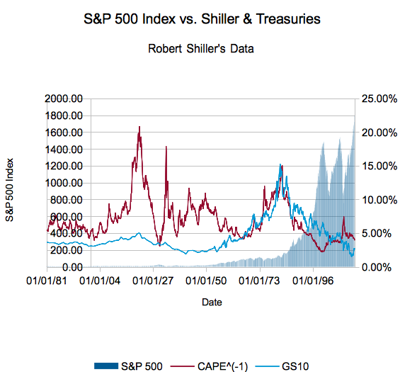
CAPE ^ (-1) (Uh, CAEP?) is in red, GS10 or the Ten Year Treasury yield is in blue (both assigned to the right axis). The bar chart in the background is the price level of the S&P 500 Index (and the reconstructed index before it had 500 stocks). Hard to see? Here's the same chart only over the last 20 years:
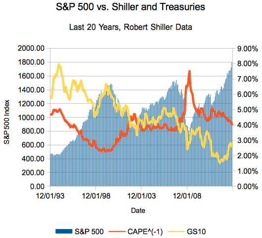 Ain't nothing changed but the colors - yellow the ten year yield and orange CAEP. The bar chart is assigned to the left axis and represents the monthly S&P index price from the Shiller data.
Yes, every time the inverse CAPE crossed the ten year yield (to be 'higher') in the last 20 years was a solid buying opportunity. Looking at the full chart, it's the rises in interest rates which make it harder to eke out a gain in the full market.
The Ten Year, in Theory
Let's discuss why this relationship exists.
Like we said a bit earlier, the ten year yield is about as safe as it comes when it comes to investments. Yes, you will get your money back - less taxes and inflation, sure, but a United States that can't pay back its debts exists in a vastly different (read: scary) world than the one that exists today. It also sets a floor on the rate companies can borrow - Exxon Mobil and Apple Computer (", Inc."?) might be the largest public companies in the world, but they are not safer than the United States. As you know, companies base plans on their cost of capital - if debt costs 10%, they won't invest in new lines promising 9.5% returns.
Same goes for investors. If you don't think companies can raise their earnings (yes, plus inflation & dividends) more than the rate of the ten year? Well then, why invest in said companies?
So, there you have it - graphical proof the risk-free rate matters. Now, many of you care about individual companies, so total market valuation is merely academic - how does this information strike you? Does this make you more or less excited about the Taper?
Disclosures: I own nothing mentioned outside of mutual funds and ETFs.
