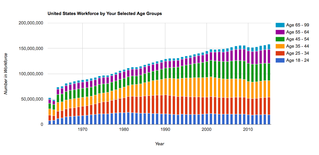
On this page, we present to you a United States Workforce by Age Calculator that computes the age ranges in the workforce (currently) from 1962-2015. You can change the age ranges highlighted by the tool by moving the sliders, and when you are happy with your work you can export the data to CSV to import into a spreadsheet program. The graph can be drawn with either relative proportions of workers or with the absolute numbers of workers, so you can see how the workforce has changed in proportion and in size.
Using the United States Workforce By Age Breakdown Calculator
Since you might not like our breakdown of age ranges, you obviously might want to change things around. We provide options to redo the math for your preferences - and we won't strand you without the data you create. Once you are happy with the inputs, download your work into a CSV.
Tool Inputs
- Age Range Slider - You can drag age groups left and right to set where you want the breakpoints to be. Don't worry, the graph will add new colors by default. If there is a gap, click on the slider to create a new, draggable range of ages. NOTE: leave a one year gap between age groups because the calculator is inclusive.
- Breakdown Type - By default we show relative numbers, graphing the workforce out of 100% (which is what you'd want to see to track average incomes over time, for example). However, you can also view absolute numbers by switching the radio to the left and recalculating.
Tool Commands & Output
- Recalculate and Draw Chart - When you have changed inputs to the tool, hit this button and the script will redo the math with your set of assumptions.
- Reset - Resets all inputs to the ones I coded into the tool (or hit the refresh button)
- Download Current to CSV - the numbers which make up the graph are output into a CSV so you can go off and do further research, or apply the data set to other data making a data mashup for the ages.
- Remove all Age Ranges - The slider will have all current groups removed so you can start over, or perhaps only graph the rise and fall of one age range over time.

Methodology and Source for the US Workforce by Age Calculator
Miriam King, Steven Ruggles, J. Trent Alexander, Sarah Flood, Katie Genadek, Matthew B. Schroeder, Brandon Trampe, and Rebecca Vick. Integrated Public Use Microdata Series, Current Population Survey: Version 3.0. [Machine-readable database]. Minneapolis: University of Minnesota, 2010.
For this series of articles, we've gone a step further in a sort of tutorial for using R. You can see details on importing this data into R to export it to a spreadsheet. That article is longer than this one, so all of your questions about assumptions we made (and even a copy of the input spreadsheet!) can be found there.
Other Reading on Demographics
One of the most important...and most ignored... caveats in all of demographics and statistics is Simpson's Paradox - the observation that apparent trends may reverse (or become more severe) when you aggregate or disaggregate data. The seminal example, also detailed in that Wikipedia piece, is batting averages (we've been on that beat since 2011!)... but most important to demographics and economics observers in the United States is the changing profile of our workforce.
A quick point: consider that even if every age group has increasing individual incomes, for example, household incomes might be appearing to decrease because of changes in the average number of workers per household. Or, another example would be the observation that the increasing number of young, Millennial workers in the workforce makes pay look more stagnant than it really is as young, inexperienced worked replace retiring Boomers with decades of experience.
No one has done more to shine a light on this aggregation problem than Bill McBride at Calculated Risk, so we thank him for the general idea for this tool. Along similar lines is this animated gif he produced back in 2013 which graphed the age of Americans per year.
At DQYDJ we have a couple along similar lines:
- Average Income Scaled to Demographics of Other Years - It uses the exact same data set, in case you want to adjust to counteract some of the changes seen in this tool.
- Total Income Earned by Age Group - Change your age group assuptions and we'll graph how much they earned.
- Makeup of the Workforce by Generation - Same question, but what if we scaled it by the generations?
- Net Worth by Age Calculator - Uses SCF 2013 data and lets you check an age versus a net worth - much more useful than comparing to aggregate data which includes all ages!
- Income by Age Calculator - Income centiles don't mean much when you compare a 47 year old to a 22 year old - this calculator lets you compare incomes to others of a particular age.
We have roughly 70 other calculators; you can find them all on this page.
Have fun with this, and be sure to let us know if you find anything interesting hidden in the data presented by the workforce by age calculator!
