
Editor: we revised this post for newer data.
In our last examination of 2013 CPS data, we took a deeper dive into age groups... and the income those age groups receive when folks report having a Bachelor's degree and working at least 40 hours a week (our benchmark for a full-time job). As expected, minor age differences (read: 5 years) make a huge difference in what it takes to break into the coveted '1%er' group for all income earners. Read on for a full report on income percentile by age in the United States.
While that article is academically interesting, it also divides the population down along elitist and often unnecessary lines... most likely, not everyone in your peer group works a full time job (for example, stay at home parents and the unemployed), and not everyone in your peer group achieved a Bachelor's degree. In fact, if your peer group is American billionaires, a full 31 of your peers dropped out of college - and up to 15% don't have a degree!
Okay, sure, billionaires are extreme examples in a country where even a single million is considered a huge sum - and basing your career and education choices on the luckiest and most extreme examples is never the safest way to plan your life. That doesn't mean that we shouldn't look at the entire population by a more fair metric - that is, break people down by age.
Income Percentile By Age Groups
Just like in our last articles using CPS microdata, on high achieving people with full time jobs and on high achievers in different age groups, we're again using total personal (NOT household) income as our income metric. As you'd expect (and as we'll detail in a later article), as you get older a larger proportion of your income will be transfer payments (most significantly from Social Security) and investment incomes. For a certain number of entrepreneurs and contractors, you'll also see a greater proportion of business income vis a vis wage income.
The safest way to work around that? Simple: break down the population into discrete age ranges, and present the data that way. That way you can associate your current income with a range for your age group, instead of trying to guess ho the data breaks down when you include the entire population.
Here's our inclusion criteria:
- Age range listed, but the data set includes all ages over 18
- Reported working at least 1 hour in the March 2013 CPS
- Total personal income (divided into quantiles as listed in the table and chart)

Income percentile by age
At first we included the "1%ers", or "quantile 99%"... but as you can imagine, it skewed the graph quite a bit. Here's the 99th quantile graphed only with the 90th quantile, for ease of viewership:
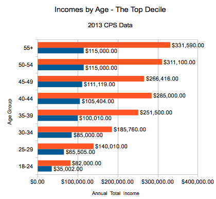
Orange: The 1%, Blue: The 10% (99th quantile & 90th quantile)
Now Easier to Read Chart Format!
We also tried to bar chart the top graph and toss incomes in there... yep, too cluttered. Here's a table which gives all the cutoff points for the various income quantiles (including the medians), so it's hopefully a bit easier to read:
| Income Quantile | ||||||
| Age Group | 10.00% | 25.00% | 50.00% | 75.00% | 90.00% | 99.00% |
| 18-24 | $2,500.00 | $6,240.00 | $13,520.00 | $23,000.00 | $35,002.00 | $82,000.00 |
| 25-29 | $9,216.00 | $17,500.00 | $30,000.00 | $45,000.00 | $65,505.00 | $140,010.00 |
| 30-34 | $11,000.00 | $20,800.00 | $35,490.00 | $55,288.00 | $85,000.00 | $185,760.00 |
| 35-39 | $12,000.00 | $22,000.00 | $40,000.00 | $65,000.00 | $100,010.00 | $251,500.00 |
| 40-44 | $13,000.00 | $24,000.00 | $41,000.00 | $69,302.00 | $105,404.00 | $285,000.00 |
| 45-49 | $12,020.00 | $24,000.00 | $40,083.00 | $70,050.00 | $111,119.00 | $266,416.00 |
| 50-54 | $13,700.00 | $25,000.00 | $42,696.00 | $72,016.00 | $115,000.00 | $311,100.00 |
| 55+ | $14,000.00 | $25,003.00 | $43,662.00 | $71,424.00 | $115,000.00 | $331,590.00 |
Source on the Income Percentile by Age Math
We downloaded the CPS microdata from the University of Minnesota’s Minnesota Population Center’s IPUMS-CPS site.
Miriam King, Steven Ruggles, J. Trent Alexander, Sarah Flood, Katie Genadek, Matthew B. Schroeder, Brandon Trampe, and Rebecca Vick. Integrated Public Use Microdata Series, Current Population Survey: Version 3.0. [Machine-readable database]. Minneapolis: University of Minnesota, 2010.
Can You Find Yourself?
So, as you could have imagined (and can now see for yourself!), there is a huge difference in being a 1%er at 24, and a 1%er at 54 - the 30 years of experience in the workforce mean it takes 4x as much income to hit the top quantile. That is, of course, a combination of wage and other types of income: a 62 year old collecting Social Security and dividend income while continuing to work a 6 figure job needs to have a higher total income to hit the upper echelons of her age group's income than the 24 year old.
So, we hope this was another interesting breakdown of what top incomes really mean in America - and whether it's really fair for a 6-figure making 20something to protest the "one percent".
Anything interesting you see in the data? (Yes, the hitch between 40-49 for the 1% is quite interesting).
