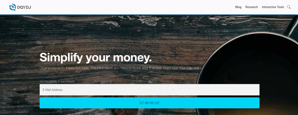
We're so proud to announce the latest incarnation of Don't Quit Your Day Job.... By the time you read these words, our new design has been up for more than 24 hours and served content to over 10,000 people.

Executive Summary: Changes on DQYDJ
The stylistic changes on the DQYDJ front end are the most obvious change of the current redesign.
There is, however, much more going on behind the scenes. We:
- Moved to a new host out of New York City (Digital Ocean).
- Performed various tweaks and speedups to improve load time by 20-40%.
- Created new resource pages for our top calculators and interactive content, as well as our original finance, economics, and investing research.
- Rewrote the About DQYDJ Page.
Your feedback finally overcame inertia on those landing pages. Thanks for reaching out (read: complaining about timeliness) – those will be much easier to keep in shape in the new format.
Why Create a New Design Now?
I'll freely admit: I've been itching to redesign the site for the last 6 months or so.
Working the front lines of the Twilio Blog redesign this year got me thinking about refreshing DQYDJ's branding. Buttressing the argument, WordPress moved by default to a new block-based editor, Gutenberg.
(Twilio's Blog is on Wagtail, which features a block editor - I saw the light and am hooked.)
While the rush of Twilio's redesign and the adaptation to a new editor were excellent reasons to proceed... I still delayed.
It was only when our previous host was purchased by a large, national hosting company that the fire was really lit. It was time to move hosts... why not make things much more complicated by also redesigning the site?
(That's a rhetorical question!)
That purchase, plus the fact that this is DQYDJ's tenth year, broke the inertia.
It was time to open the text editor and get to work.
Evolution, not Revolution on DQYDJ
When you break things down, this was merely an evolutionary change for DQYDJ, not revolutionary.
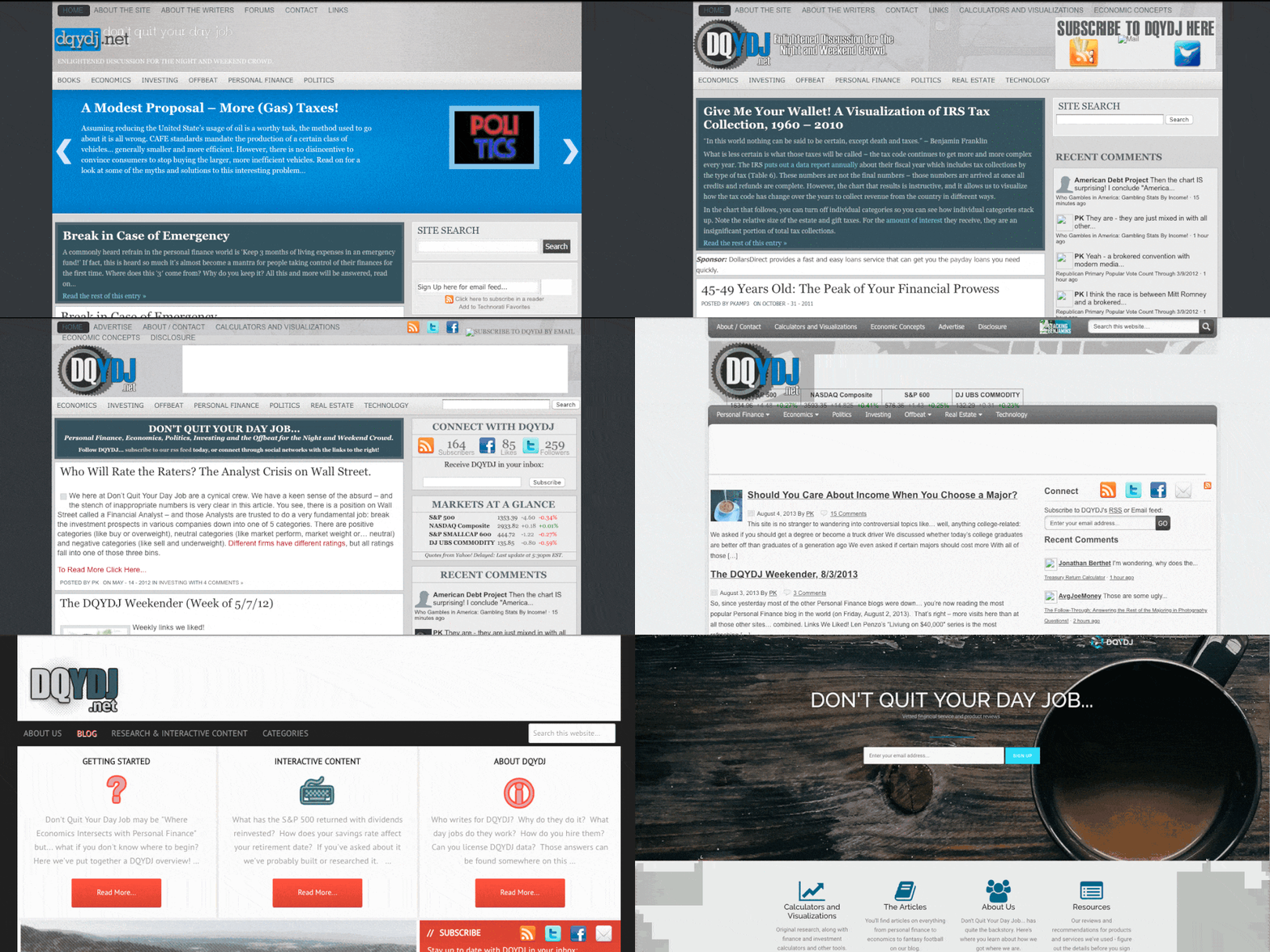
In 2016, the year of our last redesign, I had just purchased DQYDJ.com (and made it the canonical domain). We sprung for the works - new logo, new color choices: really, a whole new visual language:

And it was a great design!
Since we launched the last iteration, tons of things have happened on the web.
Organic search crawlers now judge mobile experience before desktop. Readability and experience are back in the limelight: bigger fonts, larger line spacing, and shorter paragraphs are all the rage. Page speed is now one of the most important ranking factors.
Enter this design.
As you can see from the past designs GIF, we took another step closer to a minimalist design. As is in vogue, we threw out design elements that didn't give us – and our mobile users – joy. It also meant we kept a ton: logo, landers, sidebar content, and organization.
Most importantly, we doubled down on why you come: the content.
The new DQYDJ increases the font size, increases the line height, and features a more readable line width. We let the prose breathe, while optimizing for density in images and charts and tables (and calculators).
Oh, and we focused our efforts on the landing pages (just look at the header links!).
Thank You for Being a Reader
We – and I – don't get the chance to thank you folks enough for being readers. Seriously: thank you.
To that end, I've finally written up the story I've told so many times one-on-one in the new About Page. The site started (almost) as a joke: Don't Quit Your Day Job... – directed inward.
We're coming up on our tenth anniversary at the end of May.
It's been an unbelievable ride and I, frankly, can't believe I've spent a majority of my adulthood editing and writing for a website with this incredible audience and terrible acronym. You readers are why I dutifully keep this site going. You're why Cameron and I grind out content even when our lives take a turn for the busy.
Here's to a happy and healthy 2019, many new calculators and fresh research, and new features and content we can't even dream of today.
Happy tenth year of DQYDJ. Here's to the next decade.
