As noted in a CNN article today, one way to gauge the market's reading of current conditions is by reading the bond yields. Twice I've taken a look at how you can use Treasury Inflation Protected Securities plotted with the Daily Treasury Yield Curve to get a glimpse at the market's inflation expectations (TIPS adjust their value due to CPI). Some other interesting ratios are presented, the treasury yield curve on its own, and the spread between junk bonds and government debt.
The Treasury Yield Curve
The treasury yield curve is simply a plot of government treasuries versus maturity. Treasury yields of various vintages can be found at the US Treasury's site. Yields are interpolated based on recently issued debt (debt isn't sold every day by the government).
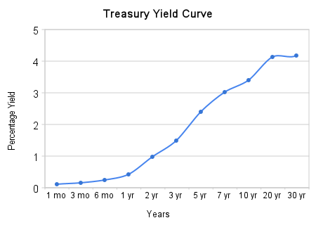
The yield curve does have some interesting predictive power. Fixed income investors (our trusty bond traders) are assumed to be rational, with their fingers on the pulse of the market and economy. They can adjust what issues they purchase according to their predictions for various entities, and the economy as a whole. Treasury bonds are tied to the predictions of the markets of economic activity - since the Federal Reserve sets the short term lending rate (based, theoretically, on the results of the economy), shorter duration bonds are closely linked to the current rate. Longer term bonds are based on a number of other factors- inflation and predicted future rates among them. It is interesting to note that the bond market is still pricing in low rates and inflation for the foreseeable future... 30 year debt is at 4.18%, according to figures today.

Treasury Yield Curve, 8/31/2009
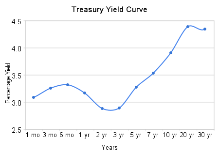
One way to read this chart is that the market expects short term interest rates to raise over the next 30 years. You should take that to mean that short term borrowing costs will be more in the future. A curve like the one shown is predicting healthy growth. On the other hand, flatter yield curves where the line appears horizontal are pricing in stagnation. Inverted yield curves, which have some maturities yielding less than other, shorter, maturities are predicting a slowdown in the economy. An example would be this curve from January 2, 2008, which shows a predicted slowdown around the 2 year maturity.

Treasury Yield Curve, 1/2/2008
Junk Bond to Treasury Spread
Another interesting indicator is the spread between so called 'junk bonds' and US Treasury Yields. Junk bonds are generally defined as bonds with ratings below BB, or 'non-investment grade'. To gauge investor 'fear', look at the spread between government debt and the high yielding issues. If the spread is very large, investors have become very risk averse. Here is the chart linked from the article.
As you can see, the premium demanded from lower ranked companies has come down tremendously since the high points last year. Whether this can be called 'healing' is debatable, but it does prove that investors are more willing to take on higher risk again. Of note: junk bonds were yielding over 20% as an aggregate at some points in the last year.
So, investors, how do you use the bond market in your investing activities?
