
Have you been paying attention to the mortgage market lately?
That's one of the reasons why we're around... to keep track of these things! We've been watching the recent mortgage rate spike with a bit of curiosity (and our fingers crossed) as we're planning on taking advantage of a refinance on our primary home. Looking at the charts, we wished we had pulled the trigger in May...
Anyway, as 30 year mortgages are the most popular, let's go to the charts:
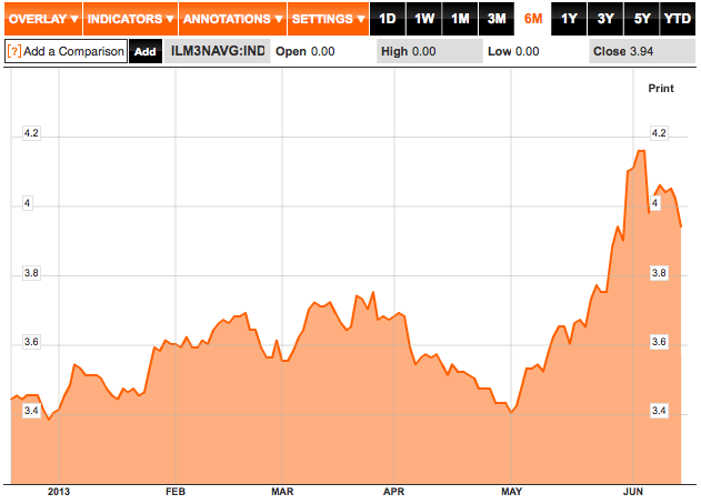
Bloomberg Chart of Bankrate 30 Year Mortgage Rate Index (Click to enlarge)
A Game Changer
In the beginning of May, 30 year mortgages were going for around 3.5%. The last 45 days have seen a climb of around .5 percentage points.
And why? A rumor, actually - specifically, a rumor that the Federal Reserve will take their foot (feet?) off the accelerator(s). Federal Reserve chairman Ben Bernanke has suggested that the Fed might slow down on their monthly purchases of $85 billion in mortgage backed securities and treasury bonds. What you see is the results of the market anticipating that move...
Meanwhile, In Inflation Expectations...
Mortgage rates aren't the only things which have increased over half a percentage point in a short time - a parallel move has been made by real rates on treasury inflation protected securities. On 1/2/2013, we had -1.36% real yields... and they've now moved to -.78%. You can get a quick gauge on market inflation expectations by subtracting real yields from interpolated treasury yields. For your convenience (and because you wouldn't like me any more if I didn't do this work!) I graphed the 5, 7, 10, 20, and 30 year inflation expectations based on that formula. These are annual rates... so 5 years would mean 'for every year, this percent inflation' (CPI, since TIPS pay based on CPI).
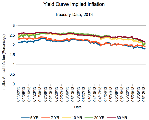
Here's the numerical breakdown:
| DATE | 5 YR | 7 YR | 10 YR | 20 YR | 30 YR |
| 06/14/13 | 1.82 | 1.93 | 2.05 | 2.07 | 2.14 |
Of note? We're back to the normal scheme, with the next 30 years expected to have the most inflation, and the shorter time spans falling in line. Note that in the chart you can see the 20 year passing the 30 year at one point - the market expected more inflation on average over the next 20 years than the next 30.
What's Next?
We've stated many times on this site we've felt inflation will be tame in the near future. That second chart? That's the market agreeing with us.
However, since we're still sans-refinance, we'll be keeping a close eye on both mortgage rates and expected inflation rates. A very close eye.
Where do you think the market is headed? And inflation?
