
For a time, we were closely watching inflation expectations – or a close approximation known as treasury breakevens, anyway. By subtracting the yield on inflation adjusted treasuries such as TIPS from the yield on treasuries you take the temperature on the market's rough expectations of inflation (CPI).
Although not the most 'exact' method, it's an easy calculation and a decent approximation of actual expectations. Call it directionally correct, okay?
Let's dive in for the first time in a while.
Inflation Expectations as of 4/12/2018
Here we've graphed treasury breakevens straight from the Treasury Department using constant maturity rates for 5 years, 10 years, 20 years, and 30 years. Importantly, the percentage here is an annual inflation percentage. That means a reading of "2%" would mean "2% every year for X years".
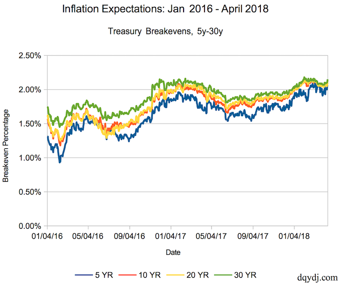
Inflation Expectations/Breakevens for 5-30 Year Securities
We've purposely graphed the history of inflation expectations back since the beginning of 2016. This encompasses all of President's Trump's term... which has seen some very interesting fluctuations in the numbers.
Let us call your attention to a couple details of our selected time-frame:
- On February 9, 2016 the expected 5 year inflation was just .93% a year. As of April 12, 2018 it more than doubled to 2.05% annually.
- The difference in expected inflation between 30 years and 5 years stood at just .10% on April 12, 2018. Back on February 11, 2016 it was .53%. The market expects similar inflation in the near term and longer term.
A Continually Flattening Yield Curve
A flattening yield curve is often a warning to expect leaner times. The yield curve, in common parlance, is a plot of the cost for the US Government to borrow money over various time periods. If it costs more to borrow over a short time period than a long one a flat or inverted curve is hinting at a weird disconnect in borrowing costs.
For a quick cut on the yield curve, FRED has an excellent series which subtracts the cost of 2 year borrowing from 10 year borrowing. That calculation currently shows a slightly ominous graph:
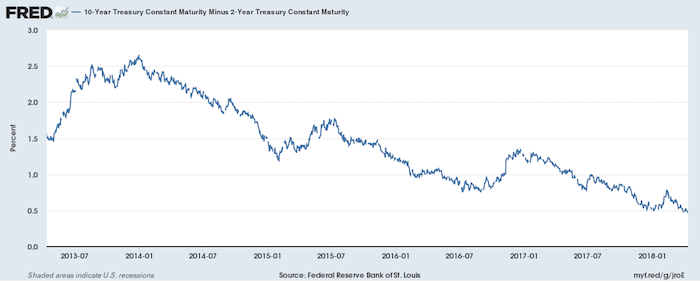
10 Year minus 2 Year US Government Borrowing Costs
Tighter Curves, Higher Inflation
For what it's worth, even the higher inflation expectations we're seeing aren't too concerning. Further, they're actually right in range of the Federal Reserve's own target of 2% inflation. A small amount of inflation is healthy for an economy, while larger inflation (or extreme 'hyperinflation') and deflation are tough conditions for a populace.
More concerning, though, would be if the yield curve inverts. While an inverted yield curve may not mean immediate harm, the phenomenon has foreshadowed the last 5 US recessions. It's a number we're going to watch closely as the curve slides towards 0% between the 10y and the 2y.
How about you? What economic indicators are you watching? See anything weird we missed in this data?
