
On this page is the United States average household net worth by year. Included summary statistics are the average net worth by year, median net worth by year, and top 1% net worth by year. Data is from the Federal Reserve SCF, 1989 - 2023.
Don't close the window after the summary data. If you scroll down, you'll find a calculator and tool to compare net worth data by year. Either see what percentile a net worth is in per year, or compare a percentile's change over time.
Household Net Worth Percentile Statistics from 1989-2023
Here I've included summary statistics of average net worth by year and median net worth by year in the United States. Also, you'll see the math for the top 75%, top 25%, top 10%, and top 5% of the net worth distribution.
Unlike with household income by year I've left out the top 1% – the net worth distribution is skewed worse than income. (Top one percent is included in the sections below – as well as in the tool.)
Average Household Net Worth by Year
In this table, I've included the average net worth by year from 1989 to 2022. The second column includes inflation adjustment to 2022 dollars.
| Year | Average Net Worth | CPI-Adjusted to 2022 |
| 1989 | $189,368 | $436,604 |
| 1992 | $187,069 | $387,602 |
| 1995 | $213,123 | $412,483 |
| 1998 | $283,640 | $517,171 |
| 2001 | $397,560 | $665,540 |
| 2004 | $449,150 | $704,979 |
| 2007 | $556,802 | $796,784 |
| 2010 | $494,916 | $675,953 |
| 2013 | $528,422 | $672,593 |
| 2016 | $689,509 | $850,420 |
| 2019 | $746,821 | $865,719 |
| 2022 | $1,059,470 | $1,059,470 |
Median Net Worth by Year
In the following table you'll find the median net worth by year in the United States. The second column uses the "current methods" CPI (see below) to adjust net worth to 2022 dollars.
| Year | Median Net Worth | CPI-Adjusted to 2022 |
| 1989 | $47,060 | $108,501 |
| 1992 | $49,700 | $102,977 |
| 1995 | $57,800 | $111,868 |
| 1998 | $71,700 | $130,733 |
| 2001 | $86,740 | $145,208 |
| 2004 | $93,100 | $146,128 |
| 2007 | $121,000 | $173,151 |
| 2010 | $77,000 | $105,166 |
| 2013 | $81,400 | $103,609 |
| 2016 | $97,290 | $119,995 |
| 2019 | $121,760 | $141,145 |
| 2022 | $192,084 | $192,084 |
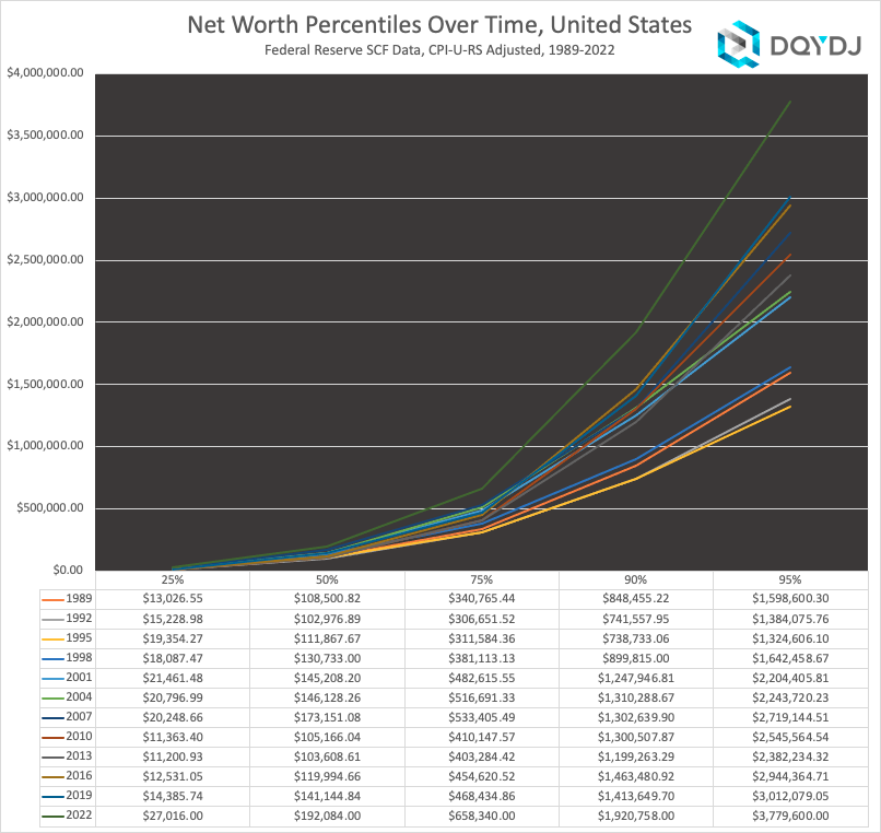
75th Percentile Net Worth by Year
The following numbers are the 75th percentile of net worth by year in the United States, or the top 25%. Next to each year's numbers you'll find the amount adjusted to current dollars.
| Year | Top 25% Net Worth | CPI-Adjusted to 2022 |
| 1989 | $147,800 | $340,765 |
| 1992 | $148,000 | $306,652 |
| 1995 | $160,990 | $311,584 |
| 1998 | $209,020 | $381,113 |
| 2001 | $288,290 | $482,616 |
| 2004 | $329,190 | $516,691 |
| 2007 | $372,750 | $533,405 |
| 2010 | $300,300 | $410,148 |
| 2013 | $316,840 | $403,284 |
| 2016 | $368,600 | $454,621 |
| 2019 | $404,100 | $468,435 |
| 2022 | $658,340 | $658,340 |
Top 10% Household Net Worth by Year
This table shows the top 10% net worth in the United States by year, from 1989-2022. Next to it you'll find the net worth adjusted for 2022 dollars.
| Year | Top 10% Net Worth | CPI-Adjusted to 2022 |
| 1989 | $368,000 | $848,455 |
| 1992 | $357,900 | $741,558 |
| 1995 | $381,690 | $738,733 |
| 1998 | $493,500 | $899,815 |
| 2001 | $745,460 | $1,247,947 |
| 2004 | $834,800 | $1,310,289 |
| 2007 | $910,300 | $1,302,640 |
| 2010 | $952,200 | $1,300,508 |
| 2013 | $942,200 | $1,199,263 |
| 2016 | $1,186,570 | $1,463,481 |
| 2019 | $1,219,499 | $1,413,650 |
| 2022 | $1,920,758 | $1,920,758 |
Top 5% Net Worth by Year
In this table you'll find the 95th percentile, or top 5% of United States net worth by year since 1989. In the third column I've include the adjustment for 2022 dollars for a fairer comparison.
| Year | Top 5% Net Worth | CPI-Adjusted to 2022 |
| 1989 | $693,360 | $1,598,600 |
| 1992 | $668,000 | $1,384,076 |
| 1995 | $684,400 | $1,324,606 |
| 1998 | $900,800 | $1,642,459 |
| 2001 | $1,316,800 | $2,204,406 |
| 2004 | $1,429,500 | $2,243,720 |
| 2007 | $1,900,170 | $2,719,145 |
| 2010 | $1,863,800 | $2,545,565 |
| 2013 | $1,871,600 | $2,382,234 |
| 2016 | $2,387,250 | $2,944,365 |
| 2019 | $2,598,400 | $3,012,079 |
| 2022 | $3,779,600 | $3,779,600 |
Top 1% Household Net Worth by Year
The top 1% is a controversial, yet fascinating group. This table lists the top 1% by net worth over time from 1989 until today. You'll also find the dollar amount adjusted to current dollars.
| Year | Top 1% Net Worth | CPI-Adjusted to 2022 |
| 1989 | $2,321,030 | $5,351,332 |
| 1992 | $2,322,741 | $4,812,648 |
| 1995 | $2,459,400 | $4,759,989 |
| 1998 | $3,801,800 | $6,931,949 |
| 2001 | $5,865,000 | $9,818,378 |
| 2004 | $6,356,000 | $9,976,275 |
| 2007 | $8,374,540 | $11,983,972 |
| 2010 | $6,816,200 | $9,309,517 |
| 2013 | $7,880,400 | $10,030,434 |
| 2016 | $10,350,300 | $12,765,759 |
| 2019 | $11,121,000 | $12,891,522 |
| 2022 | $13,666,778 | $13,666,778 |
Household Net Worth Percentile by Year Comparison Calculator
Below is a net worth comparison calculator by year. See how the distribution of net worth changed over time in the United States, or see how a net worth percentile changed over time. Also, visualize the differences in net worth by year.
Note: the bulk of survey data is collected in the year listed, although some may be collected in the subsequent year. See the average net worth research for details on the most recent data.
Mode 1: Compare to Net Worth Distribution
To compare net worth distribution in selected years, select the 'Compare to Distribution' tab. If you enter a nominal net worth and select a year, you can find out the percentile of net worth it would fall into. Additionally, the tool will graph all of the years you select for a visualization of net worth distribution changes.
Inputs
- Net Worth ($): Enter a net worth as of a particular year, using nominal dollars (dollars as of that year, not adjusted for inflation)
- Year: Select a survey year to compare the above net worth to the distribution for that year
- Compare Years: Optionally, add additional survey years to create a visualization of net worth over time
- Adjust for inflation: Adjust the previous year data to the most recent survey year's inflation data
- Logarithmic Scale: Show net worth on a logarithmic scale (note the tool will start from the 25th percentile to better avoid negative net worth)
When happy with your inputs, hit the 'Calculate & Redraw' button to visualize net worth distribution in your year (and optionally, any others).
Outputs
- Net worth %: The net worth percentile for your input net worth in the survey year
- Graph: See the net worth distribution (99th percentile to 1st) in the year you chose, and optionally any years you added in the comparison years. Hover your mouse (tap on mobile) to see net worth for a single percentile.
- Chart Tools: Zoom the graph into particular percentiles, or zoom out to the full distribution
- Download: Download the data in the visualization in png or svg graphically, or export to CSV to do work on your own in a spreadsheet program. (Please cite and link to DQYDJ and the Federal Reserve SCF if you use this data for your own post).
Mode 2: Graph Net Worth Percentiles Over Time
The second mode lets you look at particular net worth percentiles over time, from 1989 to the most recent survey. For example, you can visualize the top 1% net worth, or visualize the median net worth from 1989 until today.
Enter the percentile you're interested in in the 'Percentile' field, and optionally add other net worth percentiles. Then choose whether to adjust for inflation or not and graph the change over time.
Inputs
- Percentile (1-99): Enter the primary net worth percentile you care about to compare changes over time in the US
- Compare Percentiles: Add additional percentiles (1-99) to compare to your primary percentile in the visualization
- Adjust for inflation: Adjust each year's percentile data to the current survey. If you leave it unchecked, all years will show only nominal data
Once satisfied, hit the 'Plot Percentile(s)' button to visualize net worth change by year.
Outputs
- Graph: See the net worth percentile's change over time, from 1989 until the current year. The title will change to let you know if you selected inflation adjustment or not
- Chart Tools: Either zoom the graph to particular years, or zoom out to the full timeframe
- Download: Download a png or svg with the current visualization, or export to CSV. If you use the data, please cite and link to DQYDJ and the Federal Reserve SCF
Source and Methodology on the Net Worth by Year Data
The Federal Reserve has conducted the US Survey of Consumer Finances every three years, starting in 1983. From 1989 net worth data is harmonized and mostly comparable, so these statistics summarize net worth trends in the US since 1989.
I know that's a little unsatisfying. Let me know you'd like at least the 1986 and 1983 results and maybe I'll add some experimental numbers (it will take significant effort, so your input matters). There was actually an SCF precursor dual survey in '62/'63, too – if you're really interested, let me know.
Net Worth Data Quality
In every article on net worth (and income) I challenge you to be extremely careful with the "top few percent" of the distributions.
Nearly by definition, those percentiles aren't 'normal'/well-behaved. It's not that the numbers the tool shows are 'off', it's more that you need to apply substantial errors around the numbers, especially as you move up the distribution (2%, 1%, etc.).
In this table, I show both the number of samples – survey results – in each year's dataset. I also list the number of households that maps onto. Note, though, that households are actually "PEUs" or "Primary Economic Units" – a description is found in the net worth research methodology.
| Year | Households | Samples | After Imputation |
| 1989 | 93,020,101 | 3,143 | 15,715 |
| 1992 | 95,917,619 | 3,906 | 19,530 |
| 1995 | 99,010,458 | 4,299 | 21,495 |
| 1998 | 102,548,842 | 4,305 | 21,525 |
| 2001 | 106,495,809 | 4,442 | 22,210 |
| 2004 | 112,108,936 | 4,519 | 22,595 |
| 2007 | 116,107,641 | 4,417 | 22,085 |
| 2010 | 117,609,217 | 6,482 | 32,410 |
| 2013 | 122,530,070 | 6,015 | 30,075 |
| 2016 | 125,981,701 | 6,248 | 31,240 |
| 2019 | 128,642,431 | 5,777 | 28,885 |
| 2022 | 131,306,390 | 4,595 | 22,975 |
Inflation vs. Household Net Worth by Year
Picking a reasonable deflator for adjusting for inflation is difficult for any purpose. It's no exception here – don't mistake my precision for confidence!
Per the Fed, we use the "current methods" CPI-U-RS deflator for September of the survey year in the inflation calculations.
Net Worth Percentile by Year: A Nifty Way to Compare
The Survey of Consumer Finances is the gold standard survey for net worth in the United States. Other surveys from the Census and the IRS have weaknesses around business value or selection bias due to estate calculations. The SCF is the best estimate of actual net worth in the US.
In short: these numbers are the best estimate of historical annual net worth in the United States you can find. And they are fascinating – it's pretty awesome to see how net worth percentiles have evolved over time, inflation-adjusted or not.
As with other annual tools like income by year, note that the data isn't longitudinal. While the tool shows where the breakpoints occur over time, note that the number of households are changing over time (namely: increasing) and the same people aren't surveyed.
Read: the top 1% in 2022 literally means more money AND more households than in 1989. And it doesn't mean anything in particular for individual households – one household may move between percentiles even as the percentiles themselves increase.
Minor caveats aside, hope you enjoyed the tool and stats! Be sure to check out our other net worth tools and research. Data nerds might especially like our net worth by age series.
